Bathrooms are the most difficult room to style. However many tiles and images I view, there never seems to be one entire bathroom that inspires me. I realised a long time ago that I need to question myself as to which aspect of a tile or image makes me smile. My perfect bathroom, and yours, will be the amalgamation of a myriad of ideas. Here are a few that I like, and a few that I don’t, and why:
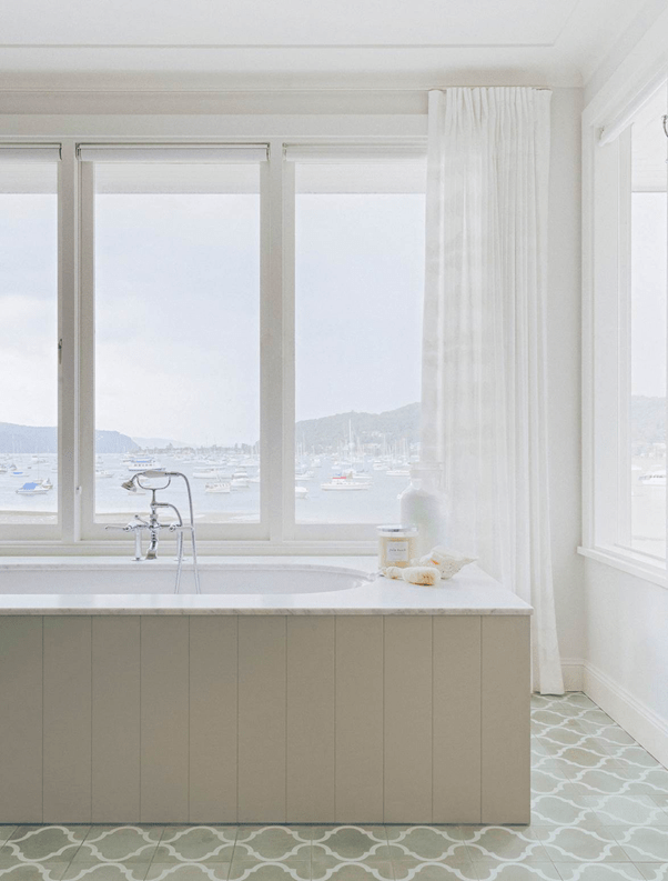
SORRENTO BEACH HOUSE | The English Tapware Company – Luxe Hamptons style from Anna Spiro, a Brisbane designer. I love the wallpaper and gilt bamboo mirror in the Powder Room, and the wall panelling throughout is stunning. The freestanding marble bath is absolutely to die for, but completely impractical unless you have staff…
ELIZABETH BAY APARTMENT – BATHROOM | The English Tapware Company – Classic Hamptons style, right down to the old fashioned shaving cabinet. I am seeing a lot of the blue cabinetry at the moment. I personally love it, but have found from bitter experience that it is much harder than white to keep clean. The freestanding bath with handy stool for a glass of something cold is a great look that is easy to achieve, but those sandy floor tiles really jar.
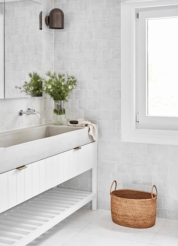
ST MARY’S BAY HOME – BATHROOM | The English Tapware Company – Loving the slight tumbled look of the otherwise classic 70mm x 10mm white wall tiles. I am also seeing some darker stone bench tops appear, but generally more stormy day than this example. And, although I am a fan of Duravit, that basin shape is just all wrong.
ST MARYS BAY HOME – LAUNDRY | The English Tapware Company – Those tumbled white 70mm x 10mm white wall tiles again. Divine, although the first scratch on the stainless steel bench top would do my head in. I’ve never been good at coping with fair wear and tear… And having gone through more washing machines than most have had hot dinners, I say “Just buy Miele”!
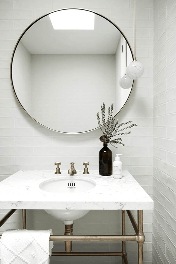
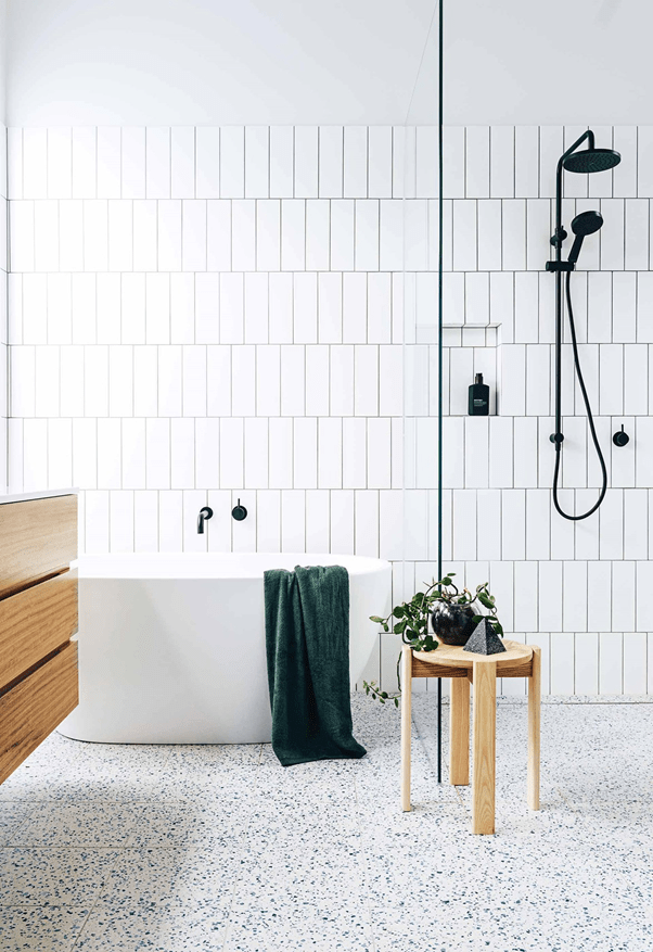
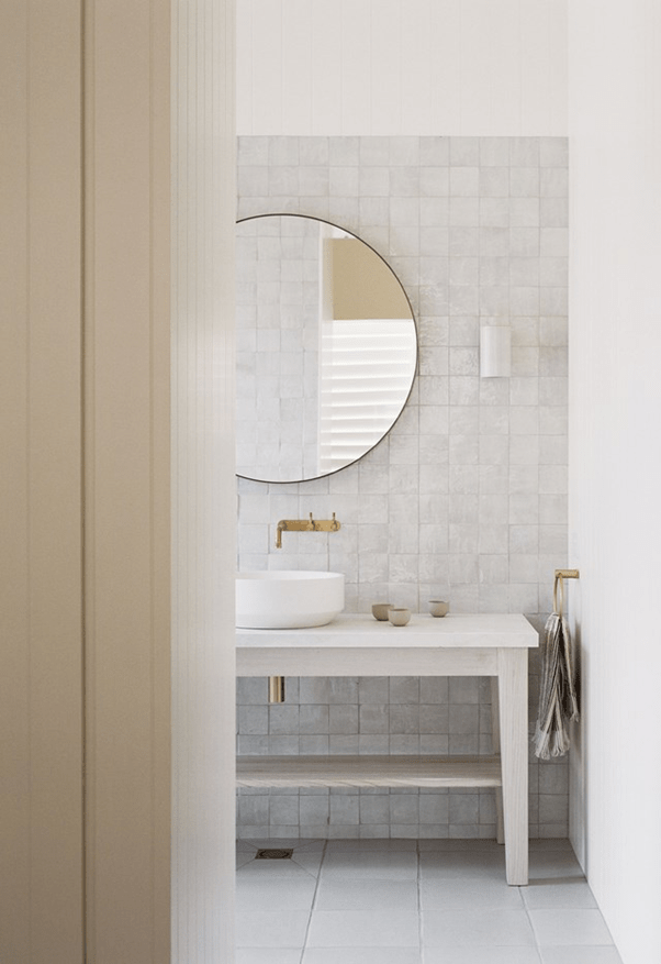
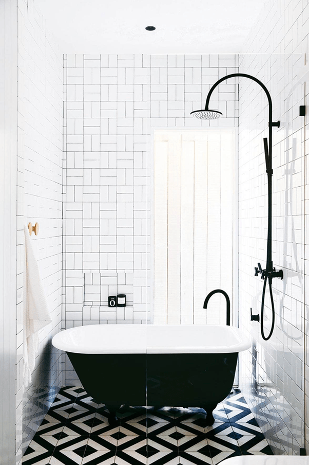
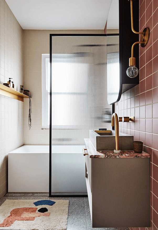
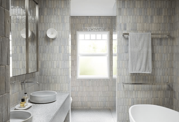
What is not to love about this bathroom? The tumbled white classic wall tiles, the brushed nickel pedestal, the (likely composite) bench top. Well, maybe not the bizarre ball on a stick light fitting and the odd flowers in the empty long neck…I am not sure how I feel about terrazzo tiles. I particularly dislike these. I also don’t like the wall tiles, the way they are laid, the timber cabinet, the timber stool and the silly dinky sized bath. I really only included the photo because of the darker wall grout. I can’t understand why, in 2021, mould-free grout is not a thing, but there you go. So in humid climates, darker grout can be used to camouflage the issue (particularly in rentals where tenants might not be too handy with the Exit Mould).This floor detail is divine as is the mirror which is a classic. The timber cabinet is truly vile.I hate the floor tiles, but the Moroccan tiles can really work in a classic look bathroom.These floor tiles are really quite funky, but somehow classic. Some with this look are encaustic (cement) and stain badly. That’s why we invented porcelain.Hmmmm, maybe not, but an example of darker grout and interesting floor detail. But maybe not…
’
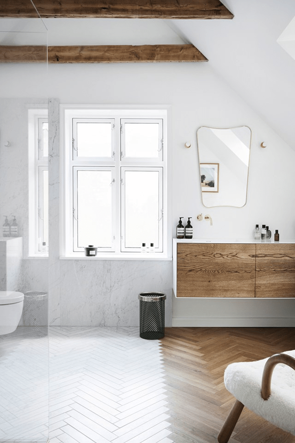
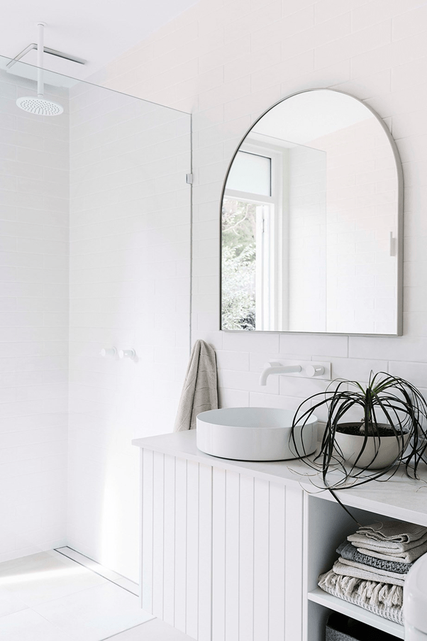
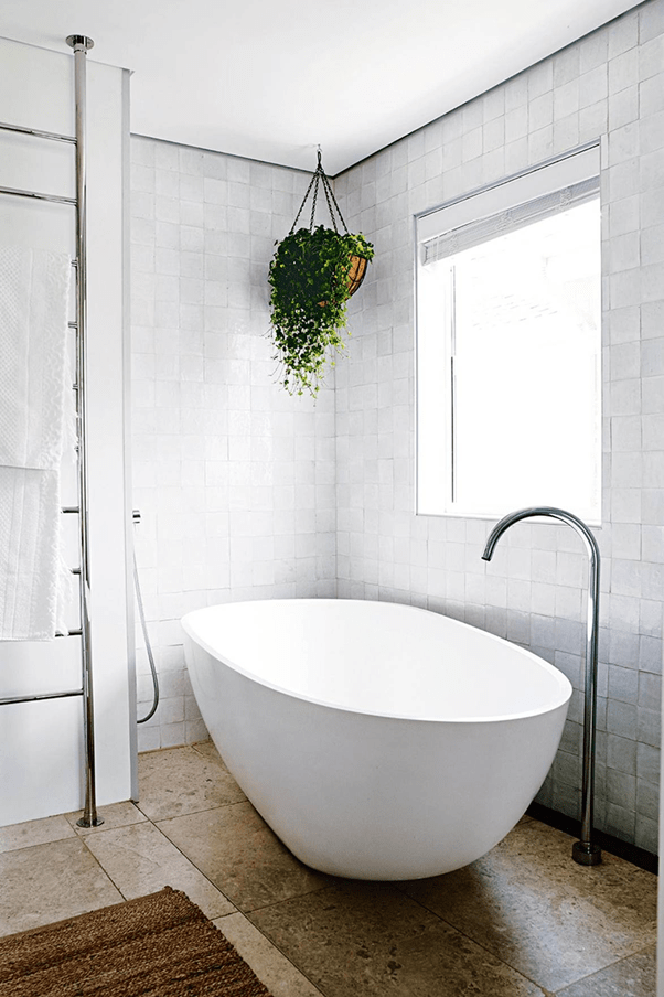
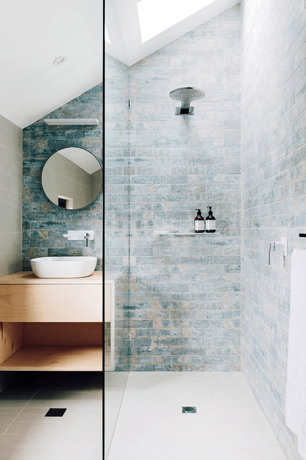
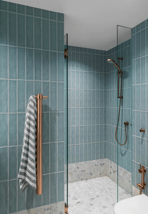
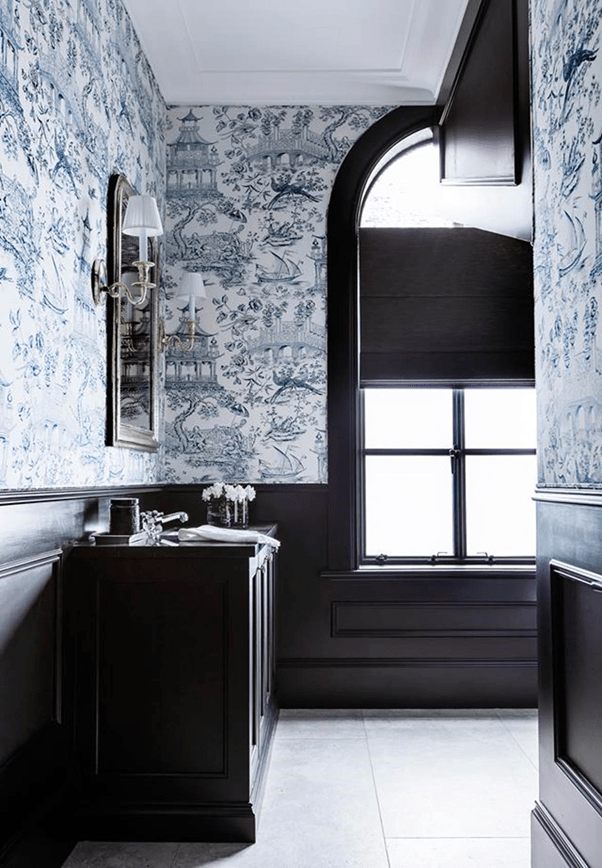
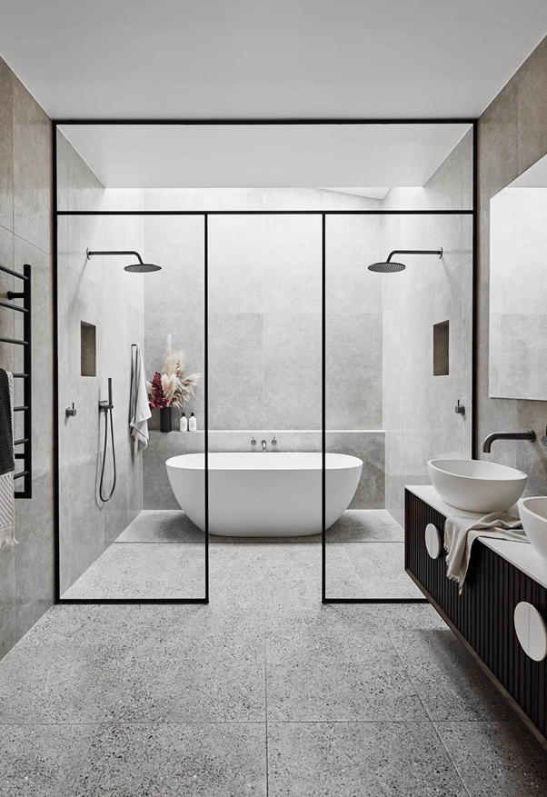
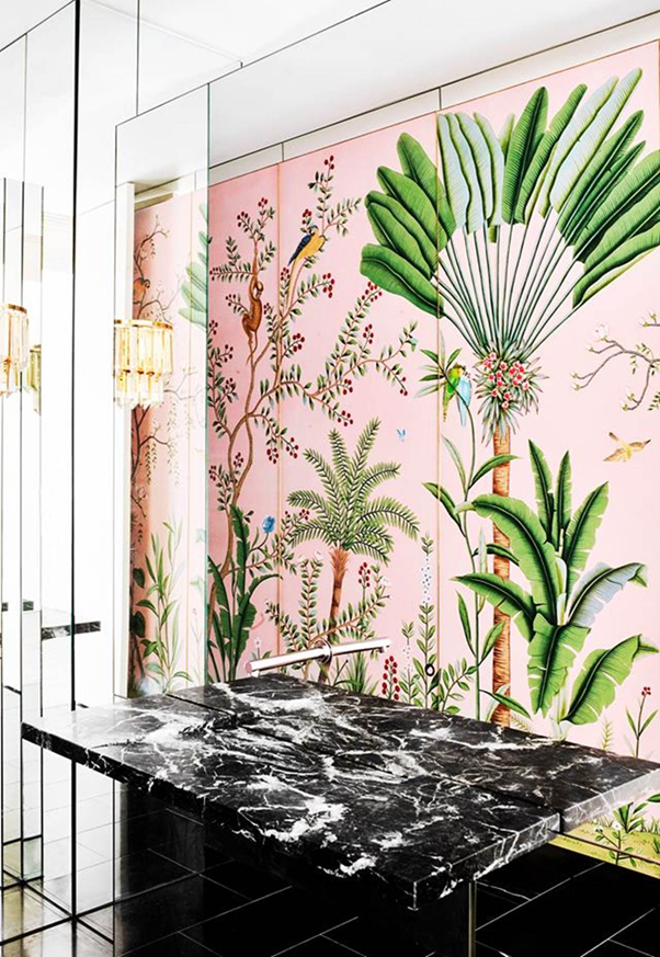
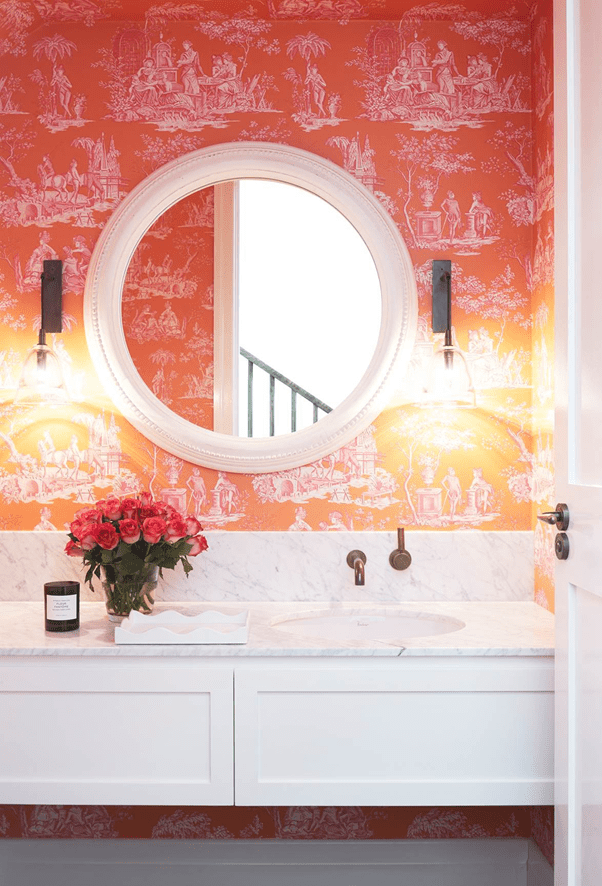
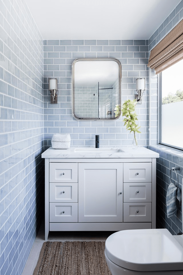
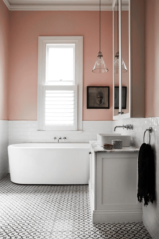
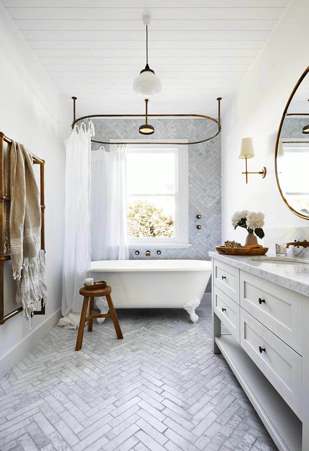
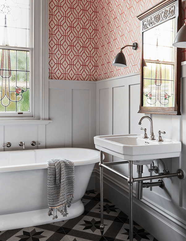
Everything about this bathroom is truly awful, except for the tongue and groove timber cabinet which I think looks quite fresh and timeless.The sole reason for capturing this photo is the window wall. Love it. The Italian terracotta floor tiles are also glorious, but completely impracticable if the bathroom is actually to be used (as they are not sealed). Can you imagine what they’d look like after a few teenage girl home hair dye adventures!Still not liking this terrazzo, but a more subtle large format tile could look good where the flooring is otherwise polished concrete throughout. And maybe tumbled white wall tiles with a darker grout.Tongue and groove wall paneling is a great look and reduces the cost of tiling when used judiciously. Large format concrete look floor tiles are also a favourite of mine.These floor tiles are monstrous. What were they thinking? And the jaunty angle of the bath?!?! But the Moroccan wall tiles are lovely.These wall tiles are dreamy. I absolutely abhor everything else. And what is with the two dinky drains. Just one grate across the rear wall would be a massive improvement.I love the cabinetry and the Moroccan wall tiles. The tessellated floor tiles are sweet, but would look rank pretty quickly with all that grout.These floor tiles could be lovely if more grey in colour and not sand, but they could be encaustic (concrete) tiles so not sealed.Bland Hamptons.Terrazzo in these sorts of soft greys, but with a much smaller speckle could be interesting. And the tiling layout here doesn’t really call to me, but the blue is quite pretty.Even blander Hamptons, but the floor tiles are quite sweet.The only thing I like about this bathroom is the Chinoiserie wallpaper. It is a mild obsession of mine. I need a powder room that I can rewallpaper every year for fun.A good example of how Moroccan wall tiles can work with a more classic cabinet (tongue and groove in this case).Truly awful, but an example of a strong floor with darker wall grout.Look past everything that is truly horrendous to find a good example of terrazzo floor tiles. Reeded glass has its place too, but not here!These floor tiles are more polished concrete than terrazzo but really work. The use of the Crittall windows as shower screens smiles at me. Not many bathrooms this would work in, but imagine if you had a spacious New York Loft in the Meatpacking District with exposed beams. I can dream….I’ve always loved mermaid scale tiles, but that’s where anything attractive about this bathroom stops. Those floor tiles scream 1982.De Gournay wallpaper. Oh be still my heart! But it’s truly astonishing how something so beautiful can be destroyed when surrounded by atrocious taste. High end brothel perhaps?Again, loving this orange Chinoiserie wallpaper. But the cantilevered shaker front cabinet with no handles is a fresh look and white painted skirting boards stop the dirty mop water creep.The cabinet is way too big and with very generic knobs and those sandy floor tiles offend me (possibly even more than the rug). But the blue subway wall tiles are lovely and the overall concept works.This photo is ONLY included because of the checkerboard terrazzo tiles. Could be an interesting look.Very classic. Very safe. They appear to have not painted the walls since 1973.I don’t do marble, but I do love a herringbone layout. The tongue and groove ceiling is also a good way to add interest, particularly in a bathroom with a low or angled ceiling.Love the wall panellng, love the satin finish console, and I actually love the floor. Oh, and the bath. I love the bath.A possibly acceptable terrazzo. The cupcake bath makes me smile.These tumbled wall tiles are a little large, but the herringbone lay is delightful.Gelato!